
Part 1: Introduction
"Data is the new oil," they say. But in reality, before that oil can power any beautiful dashboards, it usually looks like a muddy, chaotic puddle.
As a Data Analyst, you will quickly learn that 80% of your time isn’t spent building sophisticated machine learning models or flashing charts. It is spent on data cleaning. This is especially true in the Public Health sector, where historical datasets are notoriously fragmented, inconsistently formatted, and packed with human errors.
To conquer these complex raw datasets, relying on manual Excel tasks will only slow you down. This is where Power Query shines as an absolute game-changer. By leveraging its core automation engine – as detailed in my guide on From VLOOKUP to Power Query: Automating Data Cleaning Workflow (opens in a new tab) – we can completely eliminate repetitive tasks.
Today, let’s put that automation power into practice. We will analyze a real-world, messy dataset data.gov.sg (opens in a new tab) regarding Singapore’s Public Sector Hospital Admissions. By walking through the Top 3 format fixes and reusing some essential Power Query tricks, I will show you how to transform a chaotic, unusable spreadsheet into a clean, star-schema-ready dataset in just a few clicks. Let's get started!
Part 2: Meet the data and the goal
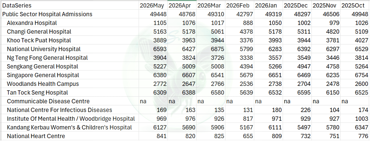
Before we open the hood and mess with the engine, let’s look at our subject. We are working with the Admissions To Public Sector Hospitals dataset from data.gov.sg (opens in a new tab).
Our analytical goal is simple: To analyze and visualize the trend of hospital admissions in Singapore over time.
However, the raw file is not ready for any visualization tool. It is formatted as a summary report for human eyes, not for database consumption. If you try to build a line chart with this raw file, you will immediately get stuck because the time dimension is scattered across dozens of individual columns.
Part 3: Fix #1 - Unpivoting Columns (The Matrix Layout Nightmare)
The Issue
When you load the dataset into Power Query, you will see the classic "Wide Format" (or Matrix layout). While columns like DataSeries run vertically, the time periods (2026May, 2026Apr, 2026Mar...) crawl horizontally to the right.
In data analytics, this layout is a nightmare. BI tools like Power BI or Tableau require a "Long Format" (Tabular layout) where every variable has its own dedicated column, and each row represents a single observation. With the current wide layout, you cannot create a continuous time axis for your charts.
The Action
Instead of manually copy-pasting for hours, Power Query solves this in two clicks:
Select the DataSeries column (which contains the hospital names).
Right-click on the selected column header -> Transform -> Unpivot Other Columns.
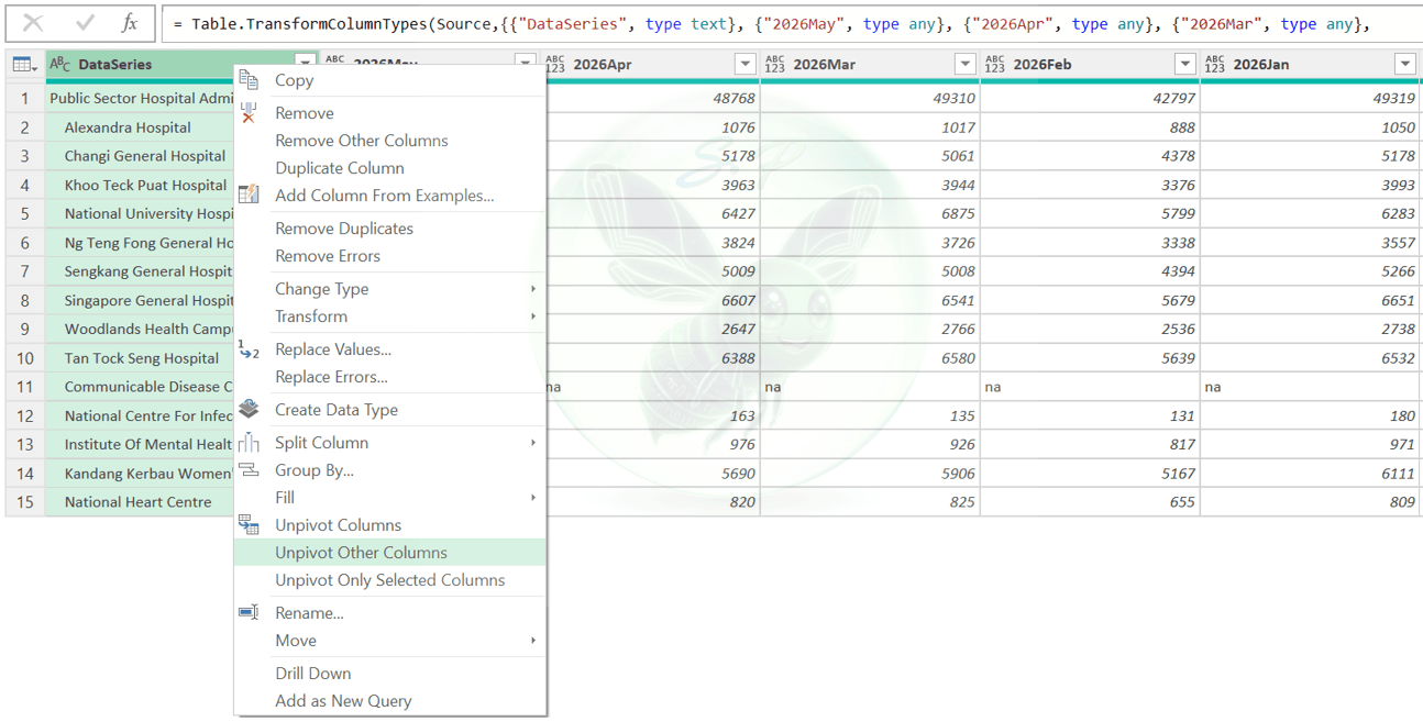
Instantly, Power Query collapses the dozens of month columns into just two neat vertical columns: Attribute (containing the zipped year-month values) and Value (containing the admission numbers).
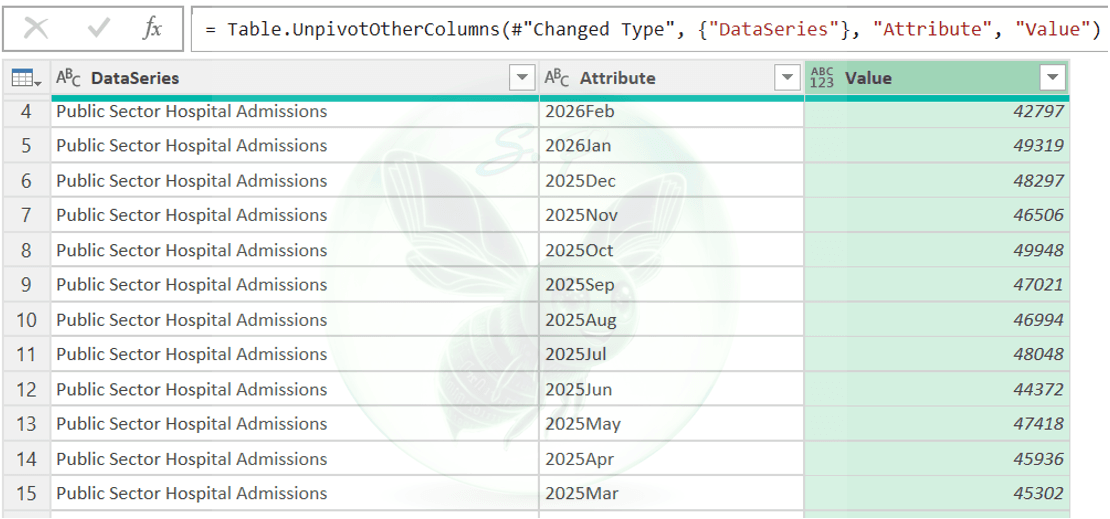
🤔Why this matters? By performing an Unpivot, you demonstrate an understanding of Tidy Data principles and Data Modeling. Standardizing data into a normalized vertical structure (Fact Table) ensures your future DAX formulas (like Time Intelligence) calculated in Power BI will execute correctly and efficiently.
Part 4: Fix #2 - Clearing 'na' Noise & Whitespaces
The Issue
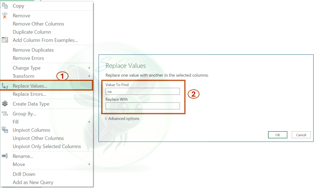
Take a look at the Value column after unpivoting. While most rows contain clean numerical admission numbers, some rows (like community hospitals) output a textual "na" string instead of a blank or a zero.
Because Power Query sees text characters mixed into a column of numbers, it forces the entire Value column into a Text data type (indicated by the ABC icon). If you try to calculate a sum or average in Power BI with this column, it will completely break.
The Action
To safely convert this column back to numbers, we must eliminate the text noise:
Select the Value column.
Right-click the header and choose Replace Values...
In the pop-up window, type "na" in the Value To Find field. Leave the Replace With field completely empty (which inputs a database null), or type "0". Click OK.
Now, right-click the DataSeries column, go to Transform -> Trim to instantly wipe out any invisible leading spaces that cause indentations in hospital names.
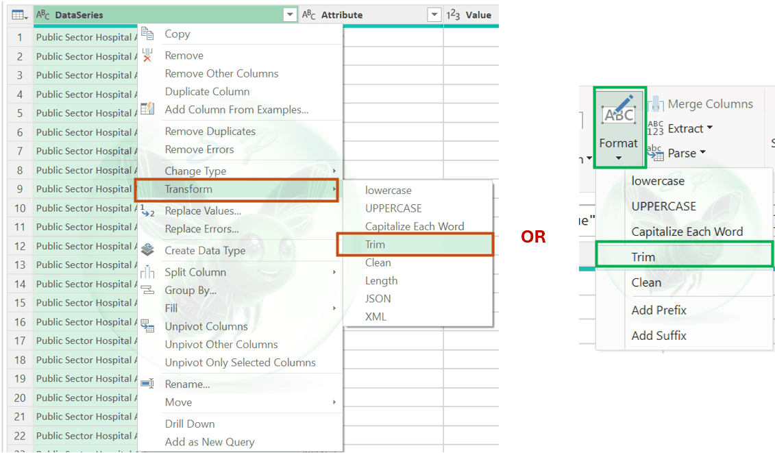
🤔Why This Matters? By replacing "na" with an empty value (null) or 0, you demonstrate an understanding of Data Types. You show that you know how to handle missing data properly without destroying the integrity of your numerical calculations, preparing the field for flawless DAX aggregations later on.
Part 5: Fix #3 - Cracking the Custom Date Code '2026Feb'
The Issue
Now, look at the Attribute column. The dates are smashed together into a non-standard custom format like "2026Feb" or "2026Jan". Power Query cannot natively recognize a year welded directly to 3 letters of an English month as a calendar date. If you try to change its type to Date via Using Locale, it will throw a wall of red Error values because a standalone month lacks a specific day and year context.
The Action
We will split and rebuild this timestamp cleanly using the built-in interface:
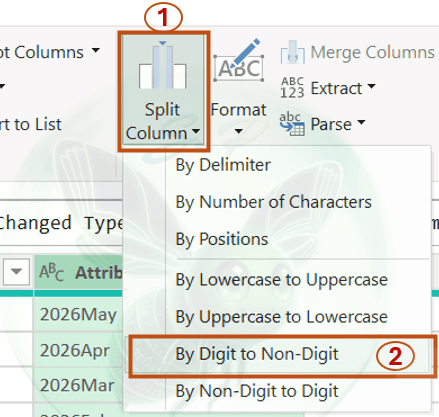
Select the Attribute column, go to Transform tab -> Split Column -> By Digit to Non-Digit. Instantly, Power Query chops "2026Feb" into two columns: Attribute.1 (Year) and Attribute.2 (Month).
Go to Add Column -> Column from Examples -> From Selection (while selecting both split columns).In the new column, type a sample date format like 01/05/2026 in the first row. Hit Enter, and Power Query's pattern-recognition engine will instantly auto-fill the rest of the rows flawlessly.
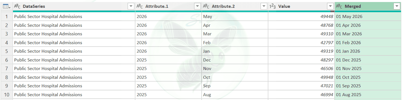
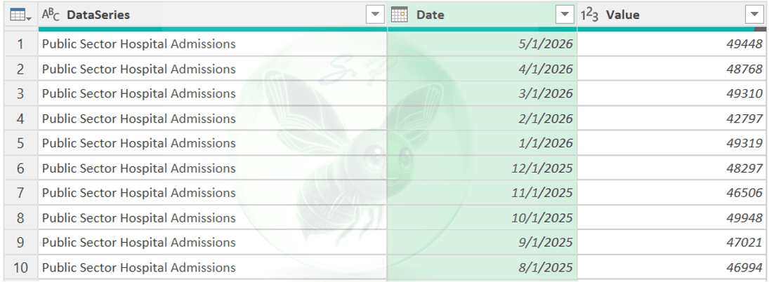
Click OK, rename the column to Date, switch its data type to Date, and safely remove the temporary split columns. Finally, change the Value column type back to Whole Number.
🤔Why This Matters? You might wonder: Our raw data only has months and years, so why force day '01' into it? This is the golden rule of Data Modeling. BI engines cannot perform Time Intelligence trends on partial text strings. A true Date data type strictly requires Day, Month, and Year. By defaulting all monthly data to the 1st day of the month, we satisfy database requirements without altering the analytical meaning of the data. On the front-end dashboard, we can easily format it to display only 'Month-Year'.
Part 6: Conclusion & Key Takeaways
Data cleaning might not be the most glamorous part of a Data Analyst's job, but it is undoubtedly the foundation of all trustworthy insights. In this project, we successfully built an automated ETL pipeline. The next time the government releases new monthly data, all we need to do is hit Refresh, and our data model will update instantly.
Now it's your turn! Download the file (opens in a new tab) and get to work cleaning up that messy public health data.
✨What is the most frustrating data cleaning challenge you've ever faced? Let’s discuss it in the comments below!
Comments
0 commentsLeave a comment
No comments yet. Start the conversation.