
1. Introduction
What would you do if you received three independent data files from a school management system: a list of grades (Marks), student profiles (Students), and a course catalog (Subjects), and were asked to generate a report showing the average score of students based on their residential city (Address) for each subject?
For 90% of traditional Excel users, the immediate answer would be: "Use VLOOKUP or XLOOKUP to pull all the data into one massive table."
But imagine if the school's data expanded to hundreds of thousands of exam records. Your Excel file would instantly bloat to hundreds of megabytes, your screen would freeze, and that familiar Not Responding error would pop up. Overusing lookup functions to "flatten" data not only degrades computer performance but also indicates a lack of understanding regarding data architecture.
If you caught my previous post on leveraging Power Query to clean and structure messy data sources (opens in a new tab), you already know that having "clean" data is just the first step. To truly transform that data into valuable reports without overloading your system, we need a higher-level skill: data organization.
In this article, we will step beyond the limitations of traditional Excel formulas and dive into Relational Data Modeling using Power Pivot. You will discover how to seamlessly connect independent tables via 1-to-Many relationships, optimize report performance, and write your very first DAX measures – one of the core skills of a true data analyst.
2. Decoding the "Star Schema" in easy-to-understand language
Before jumping into dragging and dropping in Excel, we need to understand the structural foundation of a BI-standard data model. Imagine organizing a home bookshelf: instead of throwing everything into one massive drawer (the way we do when flattening tables with VLOOKUP), we split them into two main categories: Logs and Dictionaries.
In data analytics, these two groups are known as Fact Tables and Dimension Tables. When connected, they form a layout called the Star Schema – where the log sits at the center, surrounded by lookup dictionaries.
Let’s apply this directly to our School Database:
The Fact Table – "The Log": This is our Marks.csv file. It records daily events — every row represents a student taking an exam. This table contains constantly changing numbers (Grades MarkObtained) and repetitive ID codes (StudentID, SubjectID). The Fact table answers the question: "What happened, and what are the metrics?"
The Dimension Table – "The Dictionary": These are the Students.csv and Subjects.csv files. They store master, fixed, and unique reference data. A student has exactly one row dedicated to their Name, Date of Birth, and Address. The Dimension table answers the question: "What are the characteristics of the entity involved in that event?"
🤔What is a 1-to-many relationship?
When connecting these tables, you will notice a 1 (one) on the Dictionary side and an asterisk (representing many) on the Marks fact side. The logic is straightforward: One unique student (1) in the Students table can take multiple exams and receive many different grades (*) in the Marks table.
This separation keeps your data incredibly lightweight. Excel no longer needs to repeat address or profiles thousands of times for the exact same student, optimizing memory usage by up to 80%!
3. Step-by-step guide: 3 steps to build a Data Model in Excel
Now that you have downloaded the School Database (opens in a new tab), let’s dive into connecting this structured data. The process involves 3 simple yet powerful steps.
Step 1: Load Independent Tables into the Data Model via Power Query
Go to the Data tab on the Ribbon → Select Get Data → From File → From Text/CSV.
Select the Marks.csv file and click Transform Data to open the Power Query editor. Here, you can verify data types (convert the IDs column MarkID, StudentID, SubjectID from Whole Number (123) to Text (ABC), keep the metric column MarkObtained as a Whole Number (123).
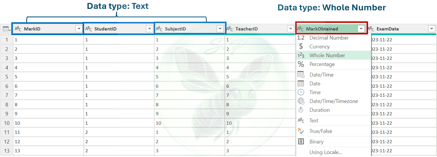
The critical step: Instead of clicking the standard Close & Load button, click the small dropdown arrow beneath it and select Close & Load To...
A dialog box will appear. Select Only Create Connection and check the box for Add this data to the Data Model.
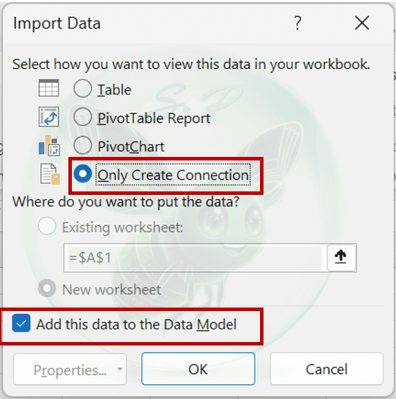
Repeat the exact same steps for the remaining two files: Subjects.csv and Students.csv.
At this point, Excel has memorized the structure of all 3 tables and stored them in Power Pivot's compressed memory background.
Step 2: Establish the 1-to-many relationships (Diagram View)
Now it's time to act as a data architect and link our "Dictionaries" to the central "Log":
Navigate to the Power Pivot tab on the Ribbon → Click the Manage button. A separate Power Pivot window will open.
In the top-right corner of the Home tab, click Diagram View. You will see your 3 tables displayed as rectangular boxes containing their respective columns.
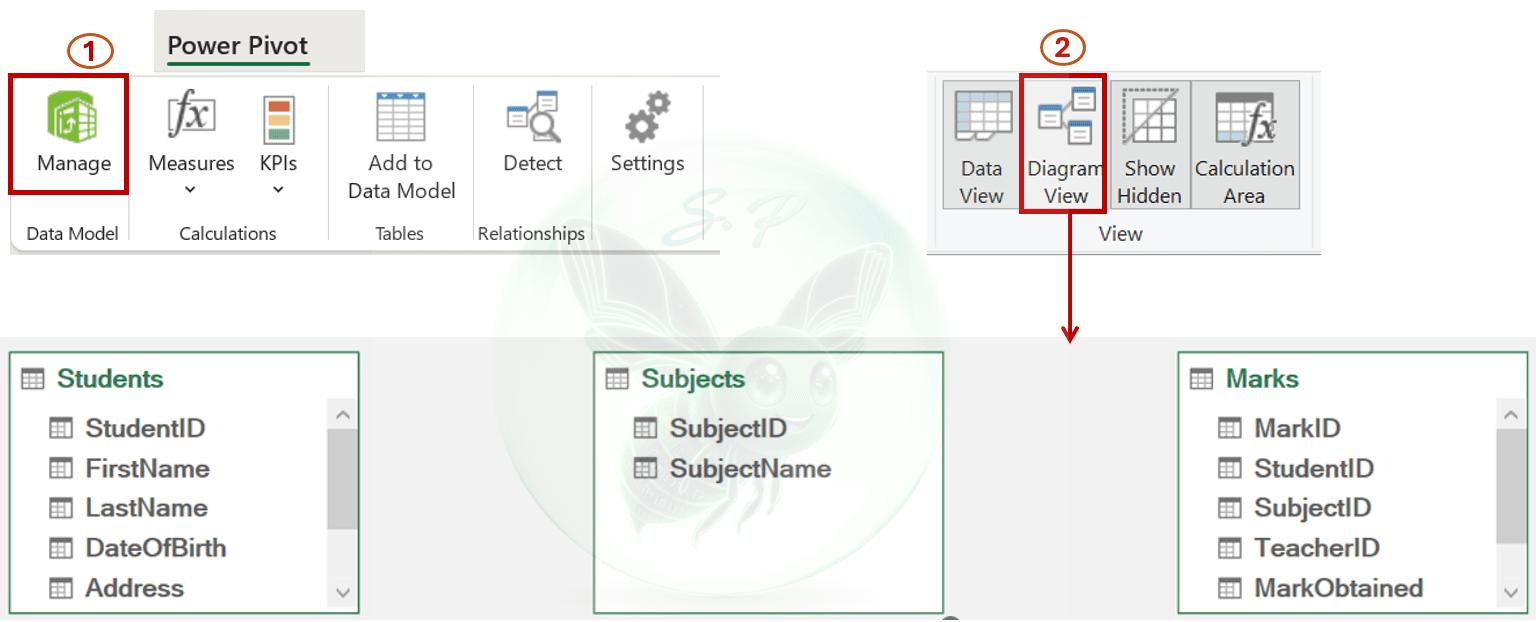
The drag-and-drop link:
Click and hold the Student_ID column in the Students table, then drag the connector line and drop it onto Student_ID in the Marks table.
Click and hold the Subject_ID column in the Subjects table, then drag the connector line and drop it onto Subject_ID in the Marks table.
Observe the relationship line: You will see a 1 on the dimension side and an * (asterisk representing Many) on the Marks fact side.
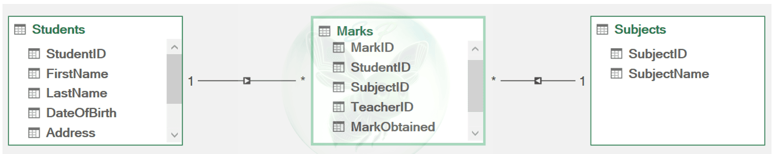
Your Star Schema is complete!
Step 3: Write your first DAX measure and generate the Pivot Table
To solve our business question – Calculate the average score of female students per subject – we will create a modern Pivot Table:
Right inside the Power Pivot window, click the PivotTable button on the Ribbon and choose to output it to an Existing Worksheet or New Worksheet.
The PivotTable Fields pane on the right side of your screen will now display all 3 tables simultaneously.
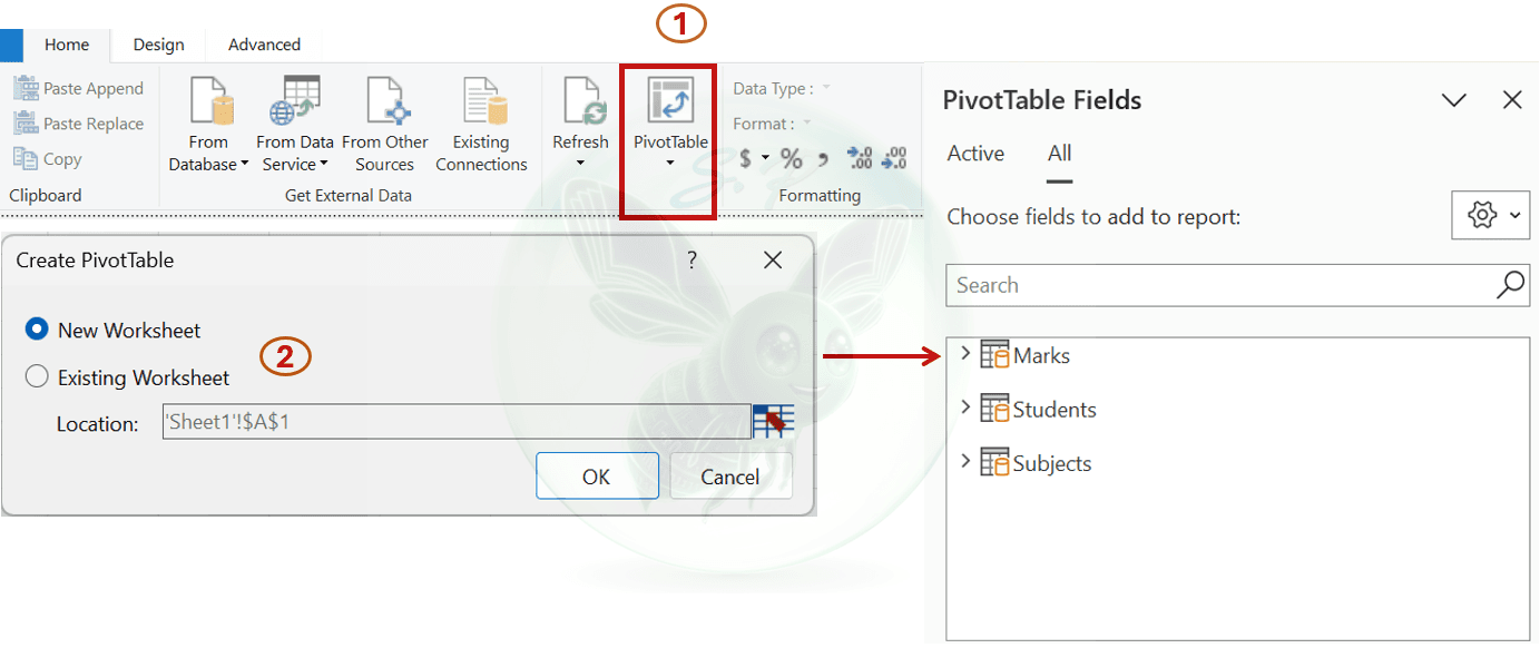
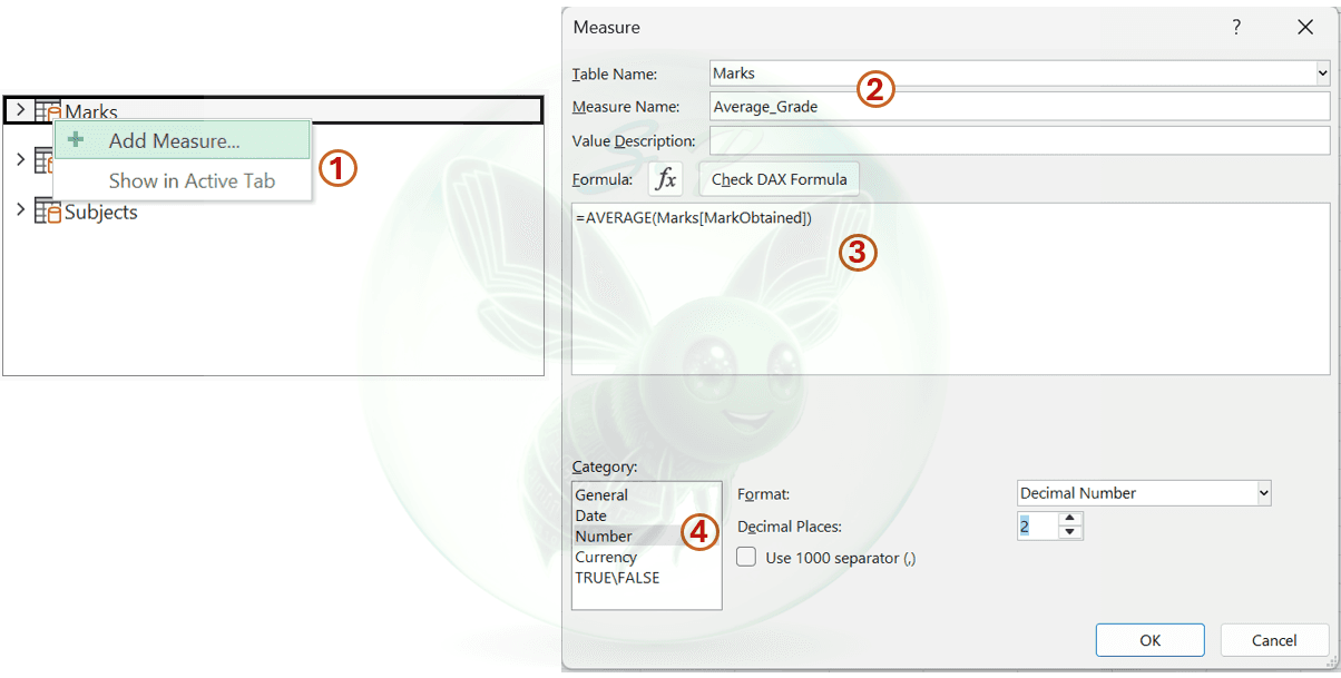
To calculate things the proper BI way, we avoid implicit columns. Let's create a explicit DAX Measure:
Right-click the Marks table name in the Fields list → Select Add Measure.
Name the measure: Average_Grade
Enter the formula: AVERAGE(Marks[MarkObtained]) and click OK.
Formatting: Select Decimal Number with 2 decimal places.
Drag and drop the results:
Drag Subject_Name (from the Subjects table) into the Rows area.
Drag Address (from the Students table) into the Filters area and filter for F (Female).
Drag the newly created Average_Grade measure into the Values area.
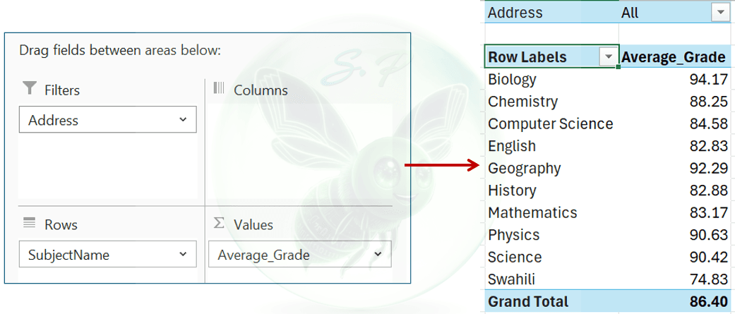
The results populate instantly. You have just built a comprehensive report spanning 3 independent data tables without writing a single VLOOKUP formula!
4. VLOOKUP vs. Data Model: the real-world difference
Looking at a small report, you might think: "VLOOKUP yields the exact same layout, why complicate things?" However, the true upgrade lies in handling large enterprise ecosystems:
Performance: If the dataset scales to 1 million rows, running repetitive VLOOKUP formulas will bloat the file to 300MB, triggering endless screen freezes. Data Model utilizes an in-memory compression engine, keeping the file around 10MB while executing instantly.
Maintenance: When new rows flow in every month, instead of manually dragging formulas down (which invites human error), a simple click on Refresh All completely re-calculates the architecture and refreshes your reports safely.
Indirect Association: The Students and Subjects tables share zero common columns. VLOOKUP cannot bridge them without transforming your central table into a dump of messy helper columns. Data Model handles this elegantly using cross-filtering.
5. Conclusion
The final Pivot Table output proves a powerful reality: We can seamlessly build complex, multi-dimensional reports without ever relying on VLOOKUP or XLOOKUP.
By shifting from a "Data Flattening" mindset to a "Data Modeling" approach, you deliver three core values to any business:
Maximum Performance Optimization: Your Excel workbook is no longer bloated with thousands of repetitive lookup formulas. Power Pivot’s compressed memory engine ensures smooth operation, even with large datasets.
Preserved Data Integrity: The source data in each table (Students, Subjects, Marks) remains clean and untampered with, removing the need for messy helper columns.
A Solid Stepping Stone to Power BI: The Star Schema layout and DAX language you just practiced in Excel make up 90% of the core foundation of Power BI.
6. Practice challenge
Ready to build your own model? [CLICK HERE (opens in a new tab)TO DOWNLOAD THE PRACTICE FILES]
🔥 The challenge: The school management system has just added a data file named Teachers.csv. The Principal has a new request: "Calculate the average student grade for each Teacher managing classes for students residing in Kenya”
💡 Quick Hints:
1. Load Teachers.csv into Power Query, convert the ID columns to Text format, and select "Add to Data Model."
2. Go to Diagram View and create a one-to-many relationship between the new Teachers table and the appropriate table in the model.
3. Reuse the Average_Grade DAX formula to create a Pivot Table that displays the requested results.
👉 Drop a comment below: How many minutes did it take you to complete this challenge? What does your Star Schema look like after adding the Teachers table? If you encounter any formatting errors, please take a screenshot and post it in the comments below so I can assist you right away! 😊
Comments
0 commentsLeave a comment
No comments yet. Start the conversation.